Form Views Guidelines
Authors: Aline Preillon, Raphael Collet
This document presents functional and technical guidelines for creating/organizing form views in OpenERP version 7.0. For each item, both the functional and technical aspects are explained. The goal of the new style of forms is to make OpenERP easier to use, and to guide users through the system.
Business Views
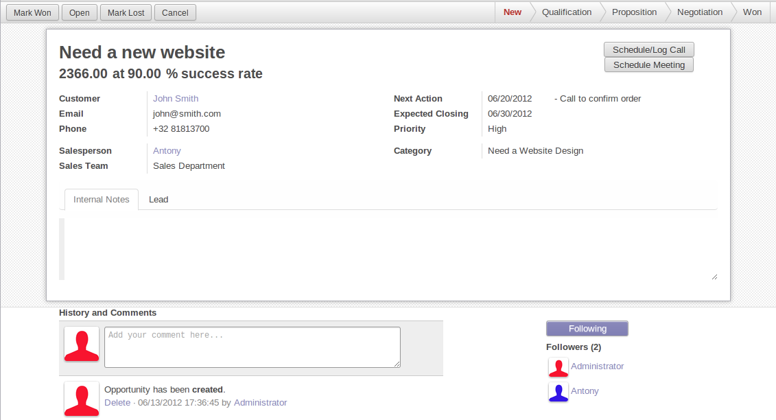
Business views are targeted at regular users, not advanced users. Examples are: Opportunities, Products, Partners, Tasks, Projects, etc.
In general, a business view is composed of
- a status bar on top (with technical or business flow),
- a sheet in the middle (the form itself),
- a bottom part with History and Comments.
Technically, the new form views are structured as follows in XML:
<form version=”7.0”>
    <header> ... content of the status bar  ... </header>
    <sheet>  ... content of the sheet       ... </sheet>
    <div class=”oe_chatter”> ... content of the bottom part ... </div>
</form>
The Status Bar
The purpose of the status bar is to show the status of the record and the action buttons, which were formerly at the bottom of form views.

The Buttons
The order of buttons follows the business flow. For instance, in a sale order, the logical steps are:
- Send the quotation
- Confirm the quotation
- Create the final invoice
- Send the goods
Highlighted buttons (in red) emphasize the logical next step, to help the user. It is usually the first active button. On the other end, cancel buttons must remain grey (normal). For instance, in Invoice, the button “Refund” must never be red.
Technically, buttons are highlighted by adding the class “oe_highlight”:
<button class=”oe_highlight” name=”...” type=”...” states=”...”/>
The Status
We use the widget “statusbar”, and the current value of the state is shown in red. One should make visible the states that are common to all flows (for instance, a sale order begins as a quotation, then we send it, then it becomes a full sale order, and finally it is done.) Exceptions or states depending on particular flow are only visible if it is the current one.


The states are shown following the order used in the field (the list in a selection field, etc). States that are always visible are indicated by the attribute statusbar_visible. One can also show some states in a specific color with statusbar_colors.
<field name="state" widget="statusbar"
    statusbar_visible="draft,sent,progress,invoiced,done"
    statusbar_colors="{‘shipping_except’:’red’,’waiting_date’:’blue’}"/>
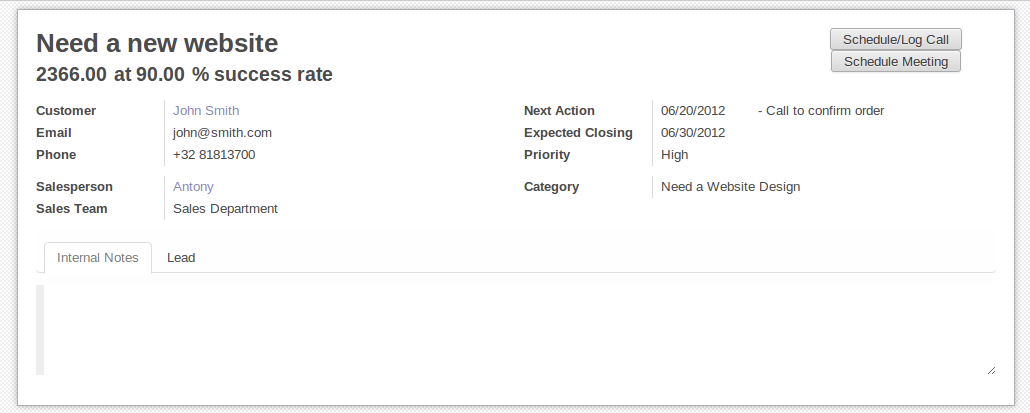
The Sheet
All business views should look like a printed sheet:
Technically, the layout of forms version 7.0 is different than former versions. There is no longer a default “grid” layout; instead the layout is more based on HTML and CSS. The following conventions are now used:
- The elements <form> and <page> no longer define groups; the elements inside are laid out inline. One should use explicit <div> or <group> to create blocks.
- By default, the element <group> now defines two columns inside, unless an attribute col=”n” is used. The columns have the same width (1/n th of the group’s width). Use a <group> element to produce a column of fields.
- The element <separator string=”XXX”/> on top of a group can be replaced putting string=”XXX” inside the <group> element.
- The element <field name=”XXX”/> does not produce a label, except when they are directly below a <group> element. Use <label for=”XXX”/> to produce the label of the field.
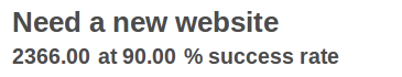
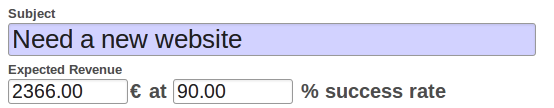
Sheet Headers
Some sheets have headers with one or more fields, and the labels of those fields are only shown in edit mode.
| View mode | Edit mode |
|
|
Use HTML text, <div>, <h1>, <h2>… to produce nice headers, and <label> with the CSS class “oe_edit_only” to produce the field’s label in edit mode. Use the CSS class “oe_inline” to produce inline fields (not blocks). The form above is produced by the following XML.
<label for="name" class="oe_edit_only"/>
<h1><field name="name"/></h1>

<label for="planned_revenue" class="oe_edit_only"/>
<h2>
    <field name="planned_revenue" class="oe_inline"/>
    <field name="company_currency" class="oe_inline oe_edit_only"/> at
    <field name="probability" class="oe_inline"/> % success rate
</h2>
Button Box
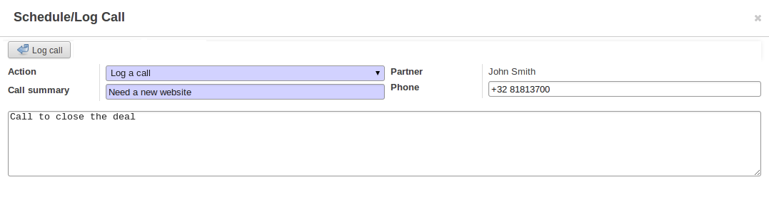
Many relevant actions or links can be directly displayed in the form. For example, in Opportunity form, the actions “Schedule a Call” and “Schedule a Meeting” take an important place in the use of the CRM. Instead of placing them in the “More” menu of the sidebar, put them directly in the sheet as buttons (on the top right).

Technically, the buttons are placed inside a <div> to group them as a block on the right-hand side of the sheet.
<div class="oe_button_box oe_right">
    <button string="Schedule/Log Call" name="..." type="action"/>
    <button string="Schedule Meeting" name="action_makeMeeting" type="object"/>
</div>
Groups and Titles
A column of fields is now produced with a <group> element, with an optional title. The title has the same effect as placing an explicit <separator> element inside the group.
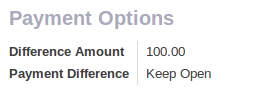
<group string="Payment Options">
    <field name="writeoff_amount"/>
    <field name="payment_option"/>
</group>
It is recommended to have two columns of fields on the form. For this, simply put the <group> elements that contain the fields inside a <group> element.
To ease view inheritance, it is recommended to put a name=”...” in <group> elements. Adding fields inside such a group is trivial.
Special Case: Subtotals
Some CSS classes are defined to render subtotals like in invoice forms:
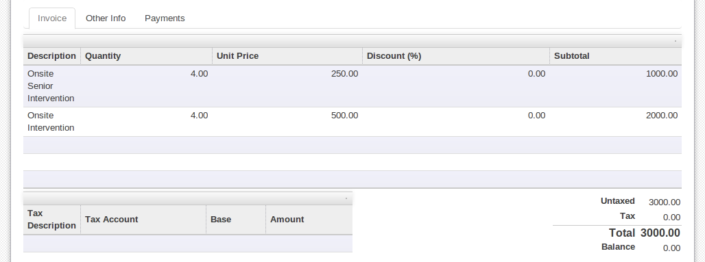
<group class="oe_subtotal_footer">
    <field name="amount_untaxed"/>
    <field name="amount_tax"/>
    <field name="amount_total" class="oe_subtotal_footer_separator"/>
    <field name="residual" style="margin-top: 10px"/>
</group>
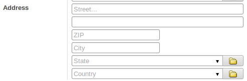
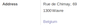
Placeholders and Inline Fields
Sometimes field labels make the form too complex. One can omit field labels, and instead put a placeholder inside the field. The placeholder text is visible only when the field is empty. The placeholder should tell what to place inside the field, and not be an example.
One can also group fields together by rendering them “inline” inside an explicit block element like <div>. This allows to group several elements in place of a field (without its label).
The following example, taken from the Leads form, shows both placeholders and inline fields (zip and city).
| Edit mode | View mode |
|
|
<group>
    <label for="street" string="Address"/>
    <div>
        <field name="street" placeholder="Street..."/>
        <field name="street2"/>
        <div>
            <field name="zip" class="oe_inline" placeholder="ZIP"/>
            <field name="city" class="oe_inline" placeholder="City"/>
        </div>
        <field name="state_id" placeholder="State"/>
        <field name="country_id" placeholder="Country"/>
    </div>
</group>
Images
Images, like avatars, should be displayed on the right of the sheet. The product form looks like:
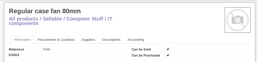
The form above contains a <sheet> element that starts with:
<field name="product_image" widget="image" class="oe_avatar oe_right"/>
Tags
Many2many fields, like categories, are better rendered as a list of tags. Use the widget “many2many_tags”:
<field name="category_id"
    widget="many2many_tags"/>
Configuration Forms and Wizards
Configuration Forms
Examples of configuration forms: Stages, Leave Type, etc. This concerns all menu items under Configuration of each application (like Sales/Configuration).

For those views, the guidelines are:
- no header (because no state, no workflow, no button)
- no sheet
Regular Wizards (Popup)
Example: “Schedule a Call” from an opportunity.
The guidelines are:
- avoid separators (the title is already in the popup title bar, so another separator is not relevant);
- avoid cancel buttons (user generally close the popup window to get the same effect);
- action buttons must be highlighted (red);
- when there is a text area, use a placeholder instead of a label or a separator;
- like in regular form views, put buttons in the <header> element.
Configuration Wizard
Example: Settings / Configuration / Sales. The guidelines are:
- always in line (no popup);
- no sheet;
- keep the cancel button (users cannot close the window);
- the button “Apply” must be red.